The Daily Tar Heel
Printing news. Raising hell. Since 1893.
Friday, Nov. 15, 2024 Newsletters Latest print issue

We keep you informed.

Help us keep going. Donate Today.
The Daily Tar Heel

Logos color student body president campaigns

The SBP candidates in the pit

Every day, thousands of UNC students pass through the Pit.

During election season, the Pit is filled with enthusiastic campaigners holding up unique designs promoting student body president candidates.

Candidates said deciding on sign symbolism is an important part of the campaign process.

A personal touch

Student body president candidate Mary Cooper has campaigned with a picture of the Old Well bearing her initials, entwined much like the classic “N.C.” of the University.

“We wanted to choose something that represented Carolina that I could add my personal touch to,” Cooper said.

Mary Cooper’s brother Jamie Cooper and UNC sophomore Asia Morris helped to create the logo.

Jamie Cooper, a sophomore art major at the University of Georgia, said his sister asked him to help with the logo over winter break.

“I thought her initials, M.C., were a lot like N.C.,” Jamie Cooper said. “We decided to play off the already existing logos of North Carolina.”

New York, New York

The Brooklyn Bridge plays prominently into student body president candidate Brooklyn Stephens’ campaign.

Depicting the iconic New York bridge and her name, Stephens’ signs play into her central theme of building bridges between students and student government.

“The connection was too good to resist,” Stephens said.

Lauren Talley, one of the logo’s designers, said she started sketching the logo on receipt paper while working in Student Stores.

“She’s all about connecting people and involving people,” Talley said.

Vote of confidence

Student body president candidate Ian Lee said his logo is clear and to the point.

“The check is a vote of confidence,” Lee said. “And the four colors signify a diverse and inclusive environment.”

Lee’s campaign manager Cierra Hinton said Lee wants to get things done for the student body.

“The check mark is connected to student voting, connected to getting things done,” Hinton said.

A new beginning

To get the day's news and headlines in your inbox each morning, sign up for our email newsletters.

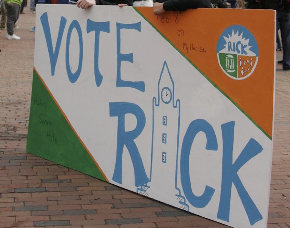
Student body president candidate Rick Ingram’s logo invites comparisons to the symbol for the 2009 American Recovery and Reinvestment Act.

Like the federal logo, illustrated with gears, stars and a sprout, Ingram’s is split into three sections — a sunrise, the Old Well and people.

“It’s a collection of the things that are important to us at Carolina,” Ingram said.

Ingram and his campaign manager Billy Kluttz said the logo similarities were coincidental.

“Logos are fairly inconsequential in these student body president races,” Ingram said.

Contact the Arts Editor

at arts@dailytarheel.com.