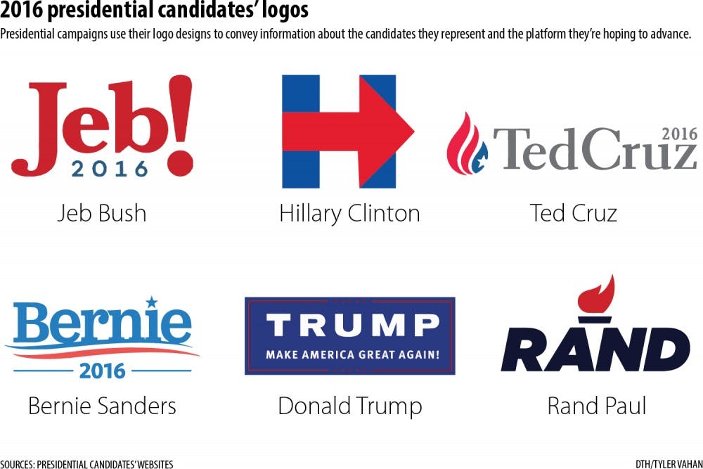
“Campaigns spend a fair amount of time on design,” said Daniel Kreiss, professor in the School of Media and Journalism. “What they want to do in some ways is use design to convey certain features or aspects of the candidate as well as what platform they’re running on in a particular way.”
Many 2016 candidates chose to put themselves on a first-name basis with voters.
“It serves to sort of humanize candidates in some particular ways,” Kreiss said. “I would imagine as well that in, for example, the decision to use ‘Jeb!’ rather than Bush, that part of that was about not necessarily wanting to conjure up relationships with the Bush family. Perhaps the same thinking is behind Hillary Clinton’s campaign as well.”
First-year Dulce Zambrano said to her, the candidates are so well known that a last name isn’t needed.
“When you say ‘Hillary,’ you know it’s Hillary Clinton,” Zambrano said. “When you say ‘Bernie,’ you know it’s Bernie Sanders.”
Kreiss said the arrow in Clinton’s logo conveys the idea that as president, she would move the country forward. He also said it is likely popular because of its versatility and ability to be altered.
“The arrow conveys the progress that I think they want the campaign and the candidate to exemplify,” he said.
Kreiss said Sanders has a slightly different motive — Sanders’ simple logo makes him seem accessible, and the first name in the logo makes him more personable.


