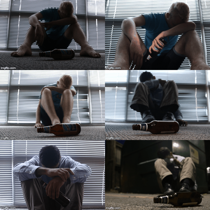
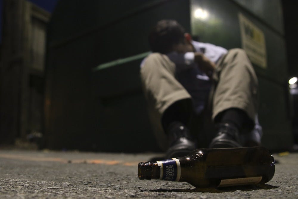
In the inaugural installment of Behind the Headlines, Photo Editor Alex Kormann takes us behind the scenes of yesterday's front-page photo illustration.
As with most things in life, the key to a successful photograph is patience (and photography is about the only thing I have patience with).

Unfortunately, the photo illustration on the front page of yesterday’s paper was not done by going outside and taking a single shot.
I started by researching how other photographers have approached the subject of alcohol in the past. The goal was to find some inspiration through images that spoke to me on an emotional and artistic level. By the time I finished, I had started to form a vision of how I wanted the image to turn out. I knew I was going to focus on the mood, lighting and location.
In my case, I knew I wanted the mood to be somber and gloomy to illustrate how alcoholism can bring people to a dark place. To go along with this, I knew that the lighting had to be dim and the location had to convey a lonely feeling.
I began to scope out some different places where there would be soft and diffused low light. That means where the light is not strong or direct, but instead fills the room and creates a very calm and quiet mood. I thought that the conference room of the Daily Tar Heel office would be a perfect location.
I waited for the “golden hour,” when the sun is low in the sky, to begin shooting. At this point, I had about four hours until deadline, so I didn’t have time to be picky with who was going to model for me. In fact, I chose the model I did because he was sitting near me while I was searching for inspiration online and I felt he (very conveniently) fit into my concept of an average college student pretty well.


